Bus IT

Enhancing the user experience of Google Maps' bus feature.
My Role
I assumed the following roles designing this app:
-
User Experience (UX) Designer
-
Interaction (IxD) Designer
-
User Interface (UI) Designer
Deliverables
Interaction Design:
High-fidelity interactive prototypes for key tasks on iOS
UX/UI Design:
-
Competitive analysis
-
User surveys and one-on-one interviews
-
Contextual inquiry
-
Personas
-
User journeys
-
Site map
-
Task flow
-
Wire frame
-
High Fidelity Mockup (Prototype)
Project Specifications
Duration: 4 months
Tools:
-
Figma
-
Miro
-
Canva
OVERVIEW
My research aims to improve bus service design by addressing issues related to bus timings, route updates, information systems, and user interface. Reports indicate that buses arrive at different times than those advertised on apps, and some buses do not appear on the app at all. We aim to understand these issues and improve the accuracy and visibility of bus timings for passengers. Additionally, we will address detour routes and route updates, ensuring users receive timely and visible information. Our research will also investigate glitches in the information system, which cause buses to disappear from maps or apps. Finally, we aim to improve the user interface of Google Maps' bus application, addressing issues with GPS direction accuracy and the subtlety of route change notifications.
USER
UW-Madison's students and faculties are the main users.
Pain Points
Schedule errors and unplanned route changes cause delays, making people late for classes and work, extending commute times.
Goal
Offer precise and timely bus details to ensure passengers are informed and ready for upcoming changes.
Problem
Description
-
Madison area bus company, there has been a decrease in the usage of bus services.
-
The number of customer complaints related to the bus service has seen a recent surge.
-
The bus company highlights that many individuals encounter negative user experiences while using map applications.

Solution
-
To address this issue, this project has been engaged to conduct multiple user research activities aimed at identifying the underlying UX problems.
-
The bus company intends to create add features to the bus application that addresses pain points and enhances the UX.
Let's look at my design process

EMPHATHIZE
DEFINE
IDEATE
PROTOTYPE
TEST
UNTERSTAND
EXPLORE
MATERIALIZE
USER RESEARCH
Redesign is essential to alleviate existing pain points for users.
I started my research with...
Competitive Inquiry
In order to understand the approaches of the existing application like Google map and transit app. We also wanted to identify functional and usability gaps by looking at alternative solutions.
Interview
For this project's interviews, we've crafted semi-structured questions with open-ended prompts for bus users. This data collection facilitates a contextual inquiry, revealing crucial details and project focal points. Encouraging open expression is paramount.
Contextual Inquiry
In this project, we joined willing bus users on their journeys, seeking feedback on their travel app. Focusing on students, our primary user base, we'll recruit through UW Madison social media for optimal responses.
FINDINGS
-
Users, particularly students, encounter issues with apps displaying inaccurate bus arrival times.
-
Route changes not reflected on maps, and a lack of notifications or updates for selected routes.
-
Additionally, buses may not appear on maps, leading to user confusion about their availability.
-
No warnings for any late or missing buses. Nor any warnings for any detour routes enroute

.png)
.png)
OUTCOMES FROM UX RESEARCH
Using UX research findings, I crafted a Persona highlighting user pain points and needs, and a Journey Map summarizing diverse bus travel scenarios and challenges.
PERSONAS

JOURNEY MAP

IDEATION
BRAINSTROMING
brainstormed ideas for improving the bus application:
-
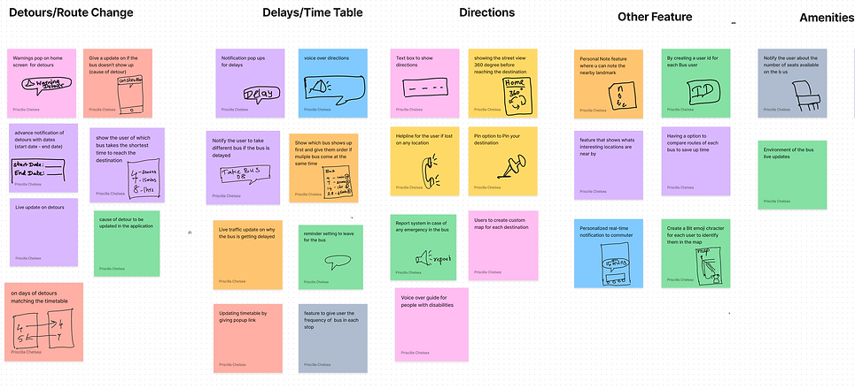
Keep commuters informed about bus detours by displaying start and end dates, as well as the reason for the detour.
-
Enhance navigation for bus commuters by using a text box and voiceover to provide clear directions to their destination. Improve the user experience for students by providing timely warnings about delays and offering updated timetables with a pop-up link after detours.

_edited.png)
SCREEN DESIGN
Let's create and visualize the ideas ....

To streamline the project's scope, I selected the "detour and delay warning" feature as the primary focus for the application redesign. Using a variety of design methods, I created a series of prototypes that ranged from low-fidelity wireframes to high-fidelity mockups. This iterative approach allowed me to refine the design and gather feedback from users, resulting in a user-centered and visually appealing application.
SKETCH
In response to initial task flow feedback, I enhanced my sketches with detailed improvements.
-
Focused on aligning screens with design goals, I refined the initial screen with detailed direction buttons and trip initiation.
-
The second screen prioritizes the most efficient bus, simplifying options.
-
Notably, I incorporated a detour notification, guiding users to a dedicated information page.
The subsequent screen integrates live location tracking, alternative bus routes, and the detour route. Crafting effective buttons and identifying improvement areas presented notable challenges in this design iteration.

PAPER PROTOTYPE

During the paper prototype testing, three users were given a scenario of registering for an account, navigating to a destination, checking for any warnings, and determining their cause (in this case, a detour).
The paper prototype testing aimed to gather feedback from users before investing resources in building a functional prototype. The users were presented with a simulated environment where they could interact with the interface prototypes. This process allowed the users to provide constructive comments on the design, highlighting areas for improvement.
USABILITY TESTING
User 1- Preethi, a first-year MS in Data Science student who frequently uses the bus, found the use of emojis to be effective and appreciated the clear organization of the interface. However, they struggled to find the detour option and suggested highlighting it in a different color.
User 2- Varshini, a first-year Business Analytics MS student, was able to complete the steps easily and appreciated the loading page option. However, they initially had difficulty understanding the purpose of the paper prototype and needed guidance to navigate it.
User 3- Varun, a first-year Industrial Engineering MS student, appreciated the use of a unique icon for updates but had difficulty selecting the correct bus option due to the lack of warning symbols. This highlighted the need for clear labeling and consideration of user preferences for visual elements.
.png)
WIREFRAME
Before creating a high-fidelity mockup for my bus application, I started with the wireframe process. I began by sketching out basic layouts and content placement, taking into consideration the usability heuristics I learned during my research. I made multiple iterations of the wireframe, adjusting elements and layouts until I was satisfied with the overall design. Once the wireframe was finalized, I moved on to testing it for usability with users to identify any potential issues before moving on to the high-fidelity mockup stage. The wireframe process allowed me to focus on the overall structure and layout of the application before adding in the details, and helped to ensure a smoother transition to the high-fidelity mockup.
FINAL PROTOTYPE SOLUTION
Before creating a high-fidelity mockup for my bus application, I started with the wireframe process. I began by sketching out basic layouts and content placement, taking into consideration the usability heuristics I learned during my research. I made multiple iterations of the wireframe, adjusting elements and layouts until I was satisfied with the overall design. Once the wireframe was finalized, I moved on to testing it for usability with users to identify any potential issues before moving on to the high-fidelity mockup stage. The wireframe process allowed me to focus on the overall structure and layout of the application before adding in the details, and helped to ensure a smoother transition to the high-fidelity mockup.

.png)
.png)
ON BOARDING
Accessing the Bus IT application by logging in for a seamless experience.
HOME PAGE
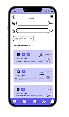
Bus IT app: Live updates, personalized recommendations, quick actions. Shows warning for detour and delays
.png)

.png)
.png)
.png)

NEW FEATURES
Revised Detour Page: Real-time bus location, delay reasons, and detour details, enhancing user awareness and experience.


.png)
