

Building a user-centric e-commerce platform for New York.
My Role
-
UX/UI Designer/Researcher
Deliverables
UX/UI Research:
-
Competitive Analysis
-
Heuristic Evaluation
-
Swot Analysis
-
Interviews
-
Survey
-
Qualitative Data Analysis
-
User Journey
-
Ideation
-
User Flow
-
Red Routes
-
Information Architecture
-
Mood Board
Project Specifications
Duration: May - Present
Team members - 6
Tools:
-
Figma
-
Figjam
-
Zoom
-
Jira
-
Slack
UX/UI Design:
-
Style Guide
-
Low Fidelity Wireframe
-
High Fidelity Wireframe
Background of the Company
Shop Online New York (SONNY) is an exclusive e-commerce platform designed specifically for the residents of New York State. SONNY represents more than a brand; it stands for “Support Our Neighborhood Networks,” highlighting the company’s mission to uplift local communities.
Founded with a visionary purpose by a passionate New Yorker, SONNY aims to connect New Yorkers through a worker-driven and socially conscious platform. The platform’s core focus is to promote local businesses by offering curated products that reflect New Yorkers' diverse interests and needs, fostering a strong connection between the community and its local economy.
Problem
-
SONNY, a new platform, faced significant challenges compared to its established competitors. With all previous cohort data erased, the UX/UI team had to start entirely from scratch.
-
This required rebuilding foundational insights, conducting fresh user research, and creating designs and functionalities that aligned with SONNY’s mission while addressing the needs of New Yorkers effectively.
Project Goals
-
Promote Local Engagement: Design a platform that connects New Yorkers with high-quality, locally sourced products to strengthen the local economy.
-
Enhance Usability and Trust: Build a user-friendly experience with transparent pricing and reliable information to foster trust and seamless navigation.
-
Establish SONNY’s Identity: Reflect the boldness and elegance of NYC through innovative design and branding aligned with SONNY’s mission.
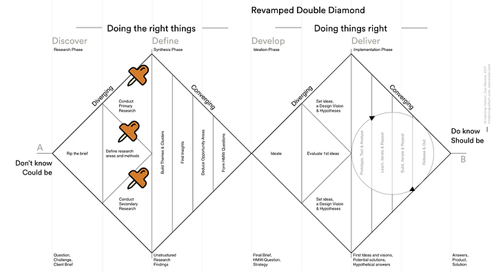
UX RESEARCH
COMPETITOR ANALYSIS
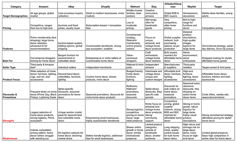
We began with a competitor analysis by reviewing various e-commerce platforms and shortlisted key competitors against which to benchmark. This analysis was instrumental in uncovering gaps in the market and understanding what our target audience values most.
-
During the development process, the competitor analysis highlighted features and services that could significantly enhance user satisfaction.
-
Key takeaways included offering a wide selection of diverse products, providing detailed product descriptions paired with clear images, and maintaining competitive pricing to attract and retain users.
Heuristic Evaluation Findings
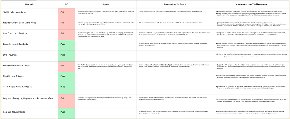
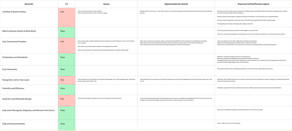
We conducted heuristic evaluations on Amazon, Wayfair, and AliExpress to identify usability issues.
Our findings revealed that users faced the most challenges in the following categories:
-
Control and Freedom
-
Visibility of System Status
-
Recognition Rather than Recall
Based on these insights, we prioritized implementing features to address these pain points:
-
Providing users with autonomy through options like a “Back” button or “Most Popular” filter.
-
Ensuring transparency by displaying inventory statuses (e.g., “Only 3 left in stock”).
-
Adding helpful links or tooltips (e.g., a “?” icon) to explain categories and features clearly.
.png)
Wayfair

SWOT Analysis
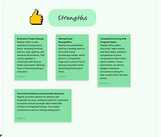
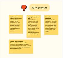
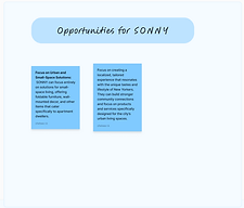
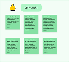
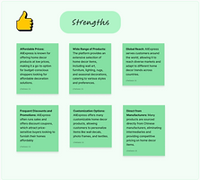
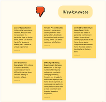
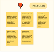
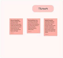
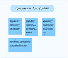
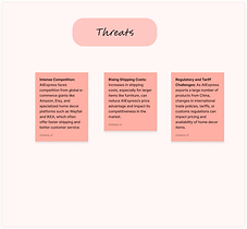
As part of our ongoing efforts, we examined the strengths and weaknesses of our competitors to better understand our target audience and position ourselves as a growing platform.
For instance, we identified some common shortcomings among the competitors we analyzed:
-
Inconsistent customer service experiences.
-
Variability in product quality.
-
Platforms being either overly niche or lacking sufficient focus.
These insights allowed us to pinpoint opportunities for growth and improvement, ensuring our platform addresses these gaps effectively.


Surveys & User Interviews
As part of our research, my team and I conducted interviews with 10 participants to better understand their experiences with online shopping platforms. These conversations provided valuable insights into user preferences and challenges, which informed our marketing and product development strategies.
Key Metrics Explored:
-
Shopping Frequency: How often users make purchases on e-commerce platforms.
-
Pain Points: Challenges users face during their online shopping journey.
-
Feature Prioritization: The aspects users value most in their shopping experiences.
-
Platform Adoption: What factors would motivate users to explore a new platform.
.png)
Findings
From our analysis, we uncovered the following trends:
-
Preferred Platforms: Most participants primarily used Amazon, while some occasionally explored Wayfair or Temu.
-
Browsing & Purchasing Habits: Users browsed platforms 1-2 times per week and typically made a purchase every 2-3 weeks.
-
Frustrations: Common pain points included:
-
Poor product quality.
-
An overwhelming number of choices, making decision-making difficult.
-
-
Platform Switching Factors: Users expressed interest in alternatives like Wayfair or Temu if they offered:
-
More advertisements to raise awareness.
-
Discounts or membership benefits.
-
.png)
Qualitative Data Analysis
Using Figma, we synthesized insights from the interviews, identifying consistent patterns:
-
Product Quality & Reviews: Users were strongly influenced by platforms offering high-quality products paired with positive reviews.
-
Advertising Influence: While social media and advertisements drew attention, they were not significant factors in driving platform adoption.
-
Shipping & Membership: Fast shipping and membership perks were significant motivators for user loyalty.
-
Product Variety: A broad product range was appreciated, but excessive options created a sense of overwhelm for many users.
User Personas
To bring our research insights to life, we created user personas that encapsulate the key patterns identified through our interviews and surveys. These personas helped us highlight the characteristics of our ideal consumer and align our strategies with their needs.
Key Traits of Our Ideal Consumer:
-
Environmentally Conscious: Values sustainable practices and products.
-
Quality-Driven: Prioritizes high-quality items and efficient service.
-
Balanced Preferences: Appreciates a variety of options without feeling overwhelmed by excessive choices.
.png)
 |  |
|---|
User Journey Maps
Building on our user personas, we created journey maps to visualize the expectations and actions users might take on our platform. Key insights included:
-
Users prioritize quality over other factors.
-
Positive customer reviews and fast, efficient shipping strongly influence decisions, while advertisements have minimal impact.

 |  |
|---|
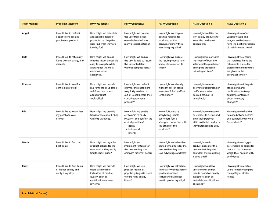
How Might We Statements
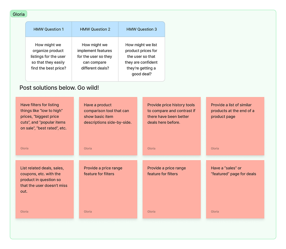
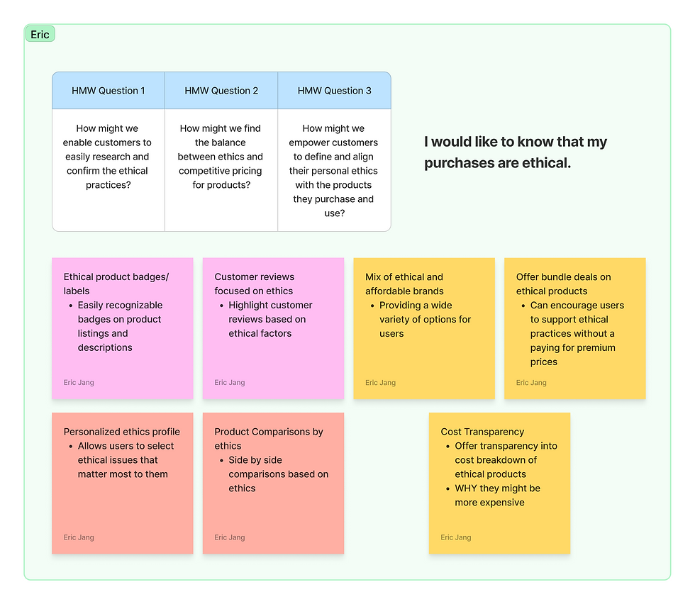
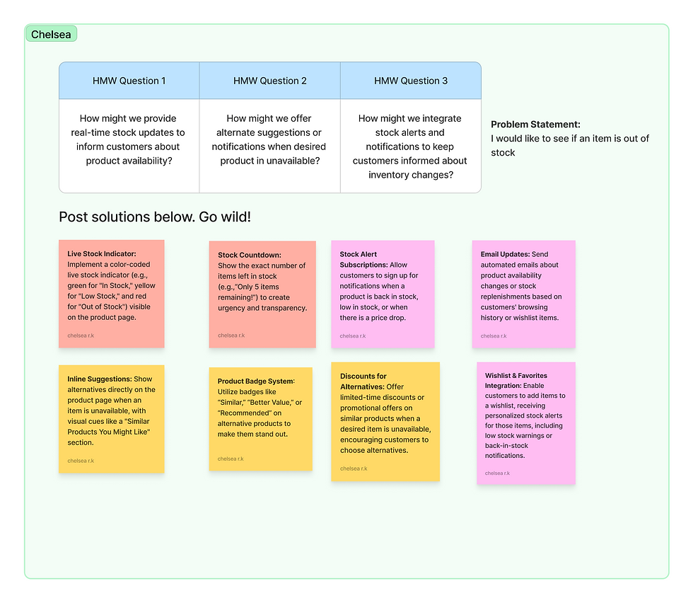
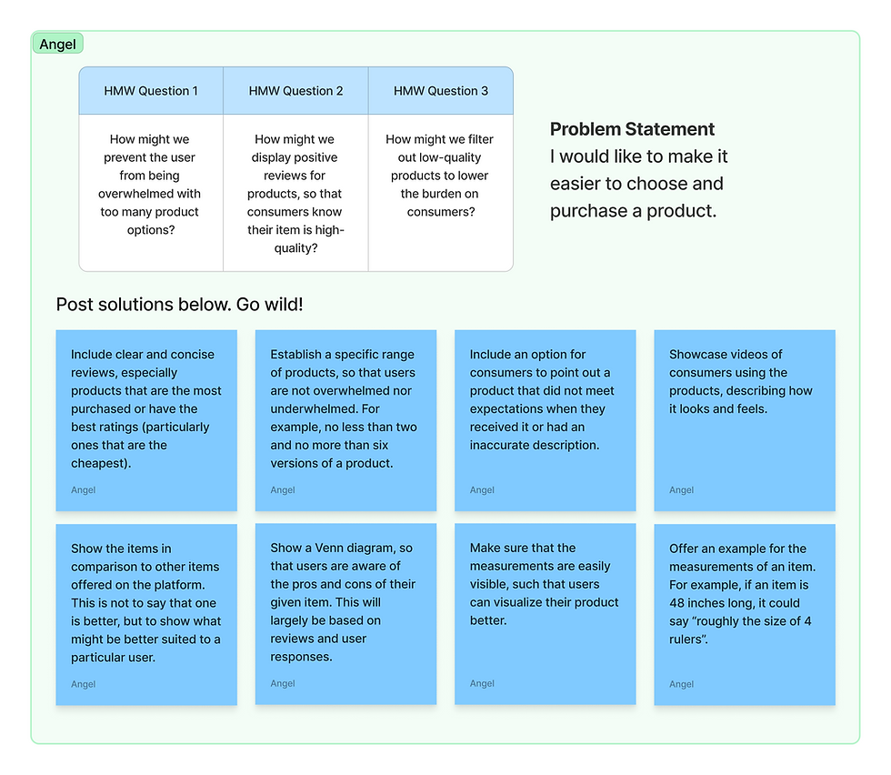
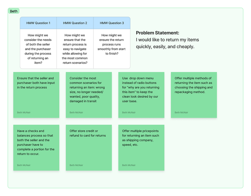
After completing the user journey, we developed How Might We statements to address the most critical challenges identified. These statements served as a foundation for brainstorming innovative solutions, guiding our ideation process to ensure each idea was user-focused and addressed specific pain points effectively
.png)
IDEATION

.png)
User Flows
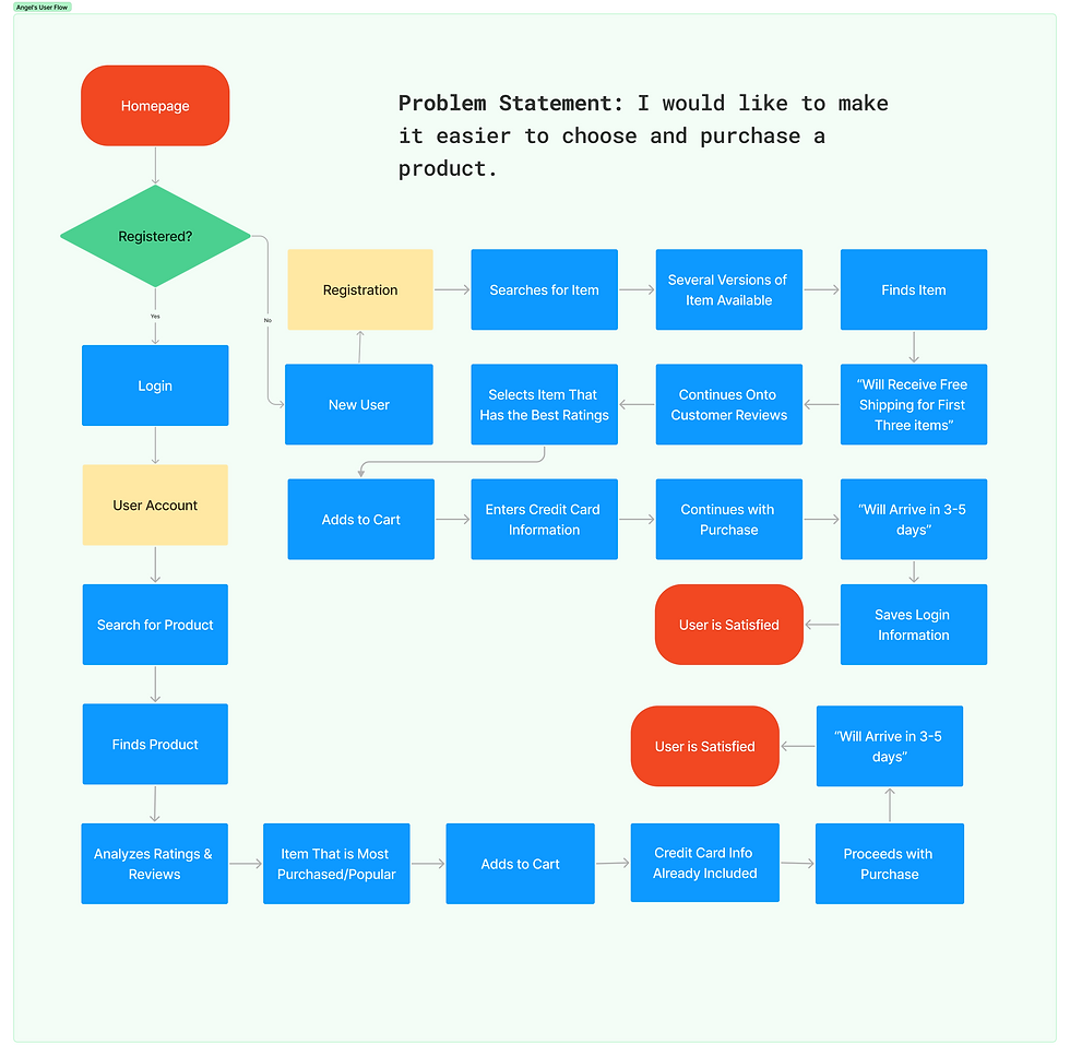
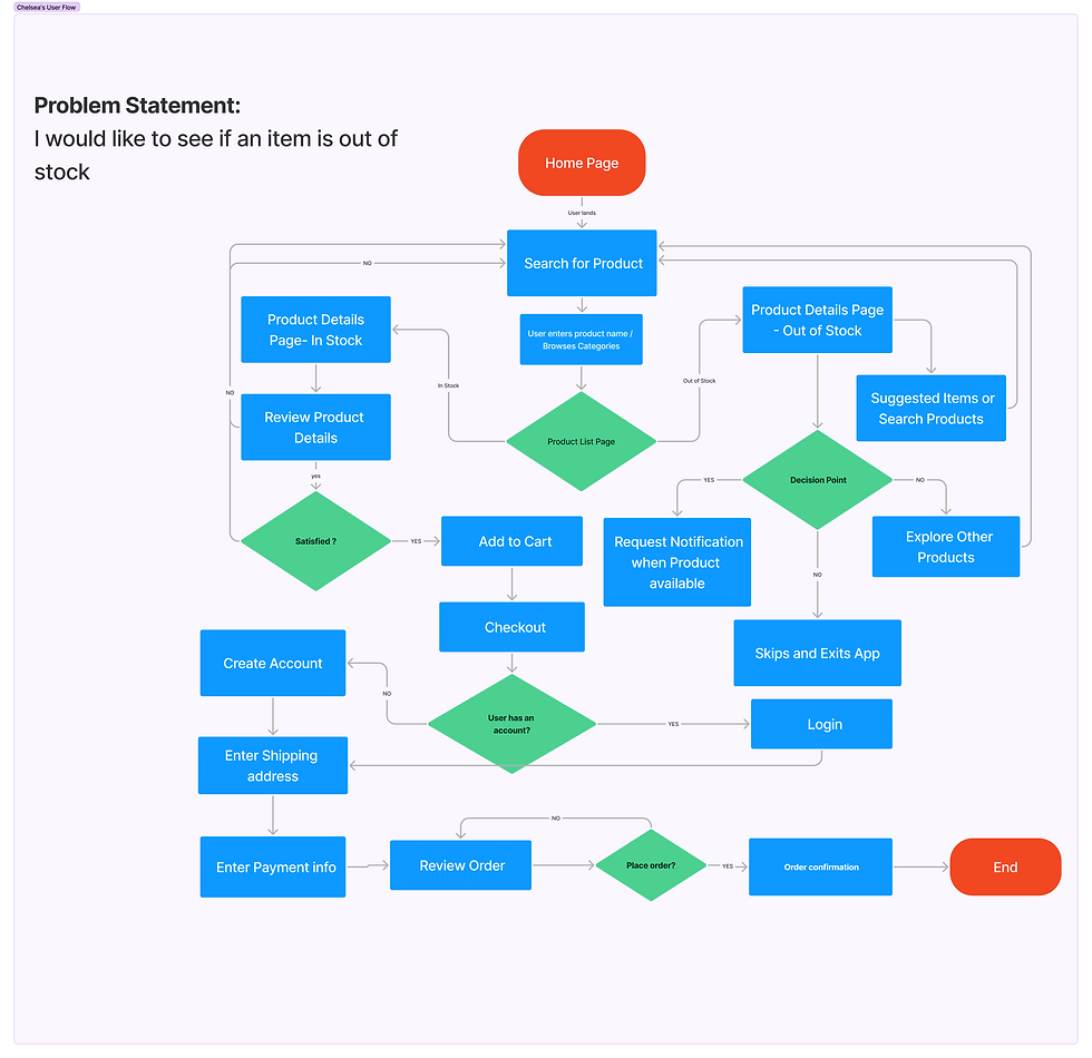
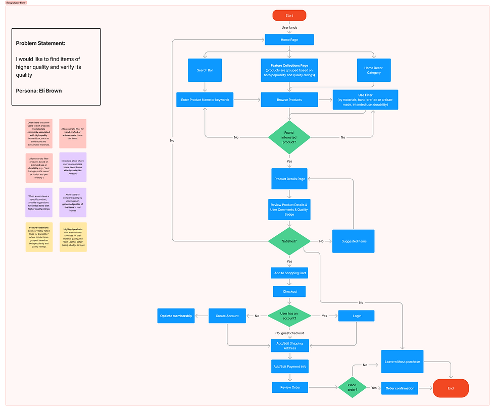
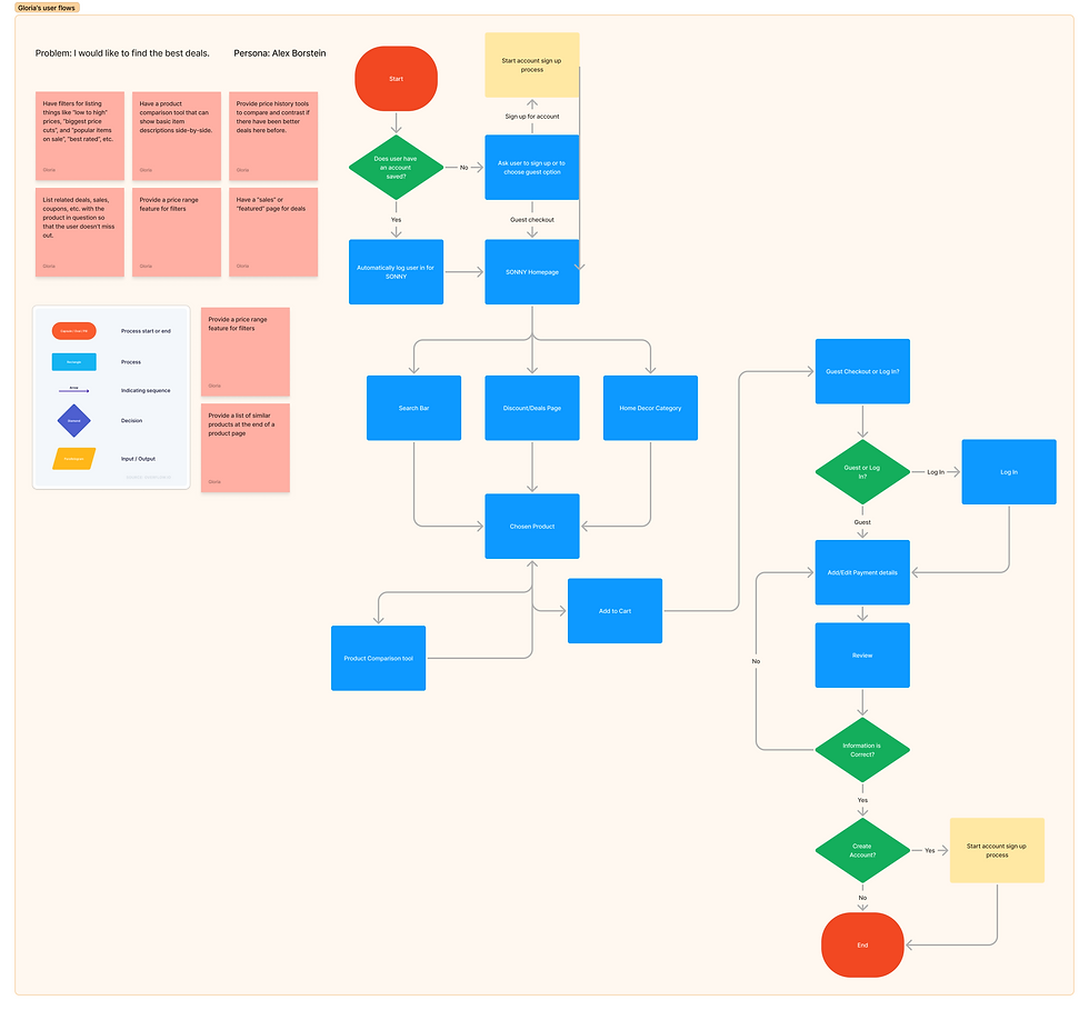
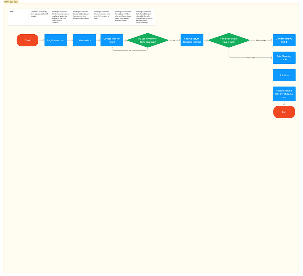
User flows allowed us to articulate and structure our problem statements effectively while gaining deeper insights into user behaviors. By mapping these flows, we identified critical touchpoints and streamlined processes, ensuring a smoother user experience.

Red Routes
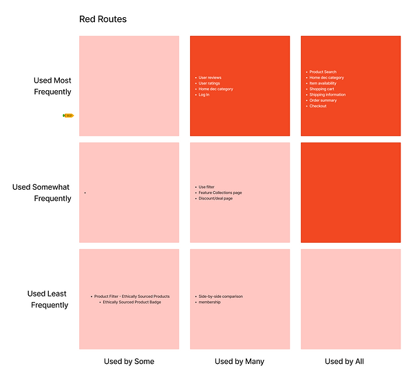
Red routes highlighted consistent behaviors and priorities across our users. For example, most valued positive customer reviews and appreciated side-by-side product comparisons, emphasizing the need for features that support informed decision-making.
.png)
Information Architecture
With input from the development team, we began creating the information architecture for the SONNY website. Using the provided content list as a foundation, we structured and organized the website’s layout to ensure seamless navigation, clear categorization, and an intuitive user experience tailored to the platform’s goals.
.png)
.png)
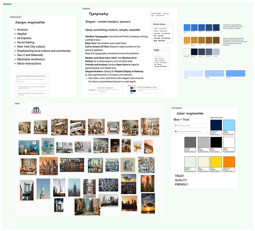
Mood Board
We created a mood board drawing design inspiration from platforms like Amazon, Wayfair, and AliExpress.
Key Design Elements:
-
Typography:
-
Elegant and sophisticated headers using Playfair Display.
-
Clean and modern body text with Lato.
-
-
Imagery:
-
Inspired by New York's architectural elements, blending urban sophistication with visual appeal.
-
-
Color Palette:
-
Stuck to the logo's color theme, complemented by soft pastel shades for a cohesive and inviting look.
-
.png)
STYLE GUIDE



.png)
.png)
.png)

.png)


